.png)
.png)

 1001
1001
The Purchase Method dashboard allows you to compare sales between delivery and on-premise orders or between online orders and in-store sales. It can be found in Retailer under the "Overview" section.
Currently this dashboard is compatible with the following POS systems:
- Order Method: LeafLogix API, MJFreeway, Treez
- Delivery Flag: Greenbits, Leaflogix API, Cova, Biotrack Cloud, Treez, Flowhub API
How to use this Dashboard:
Filters
- Store Name: choosing a store is required. Multiple store selections are allowed
- Date Range: this determines over what period of time you will be comparing your different purchase methods
- Date Granularity: this determines how granular the date axis will be, particularly in the "Purchase Method Sales Performance" and "% of Transactions" tiles.
- Category: this is an optional filter for use if you only want to see a single or subset of product categories
- Delivery Flag Option: this determines what you are comparing. You have two choices:
- Order Method: this compares whether a sale originated in store or online. This is only available for stores on Leaflogix API, MJFreeway or Treez
- Delivery Flag: this compares orders that were delivered vs purchased/picked-up in store. This is only available for stores on Greenbits, Leaflogix API, Cova, Biotrack Cloud, Treez, Flowhub API
Key Metrics

This table at the top of the dashboard gives you overall key metrics for understanding the differences between purchase methods, particularly Total Revenue, Average Basket, Units per Basket, and Percent Discounts.
Sales Performance and % of Transactions

This pair of tiles shows you how much revenue was gained through each type of purchase and what percentage of transactions were attributed to each type of purchase. These two charts show the data at the granularity defined in the "Date Granularity" filter for the length of time defined in the "Date Range" filter. Use these graphs to understand how demand for delivery or online ordering shifts over time.
Basket Metrics and % of Category Sales
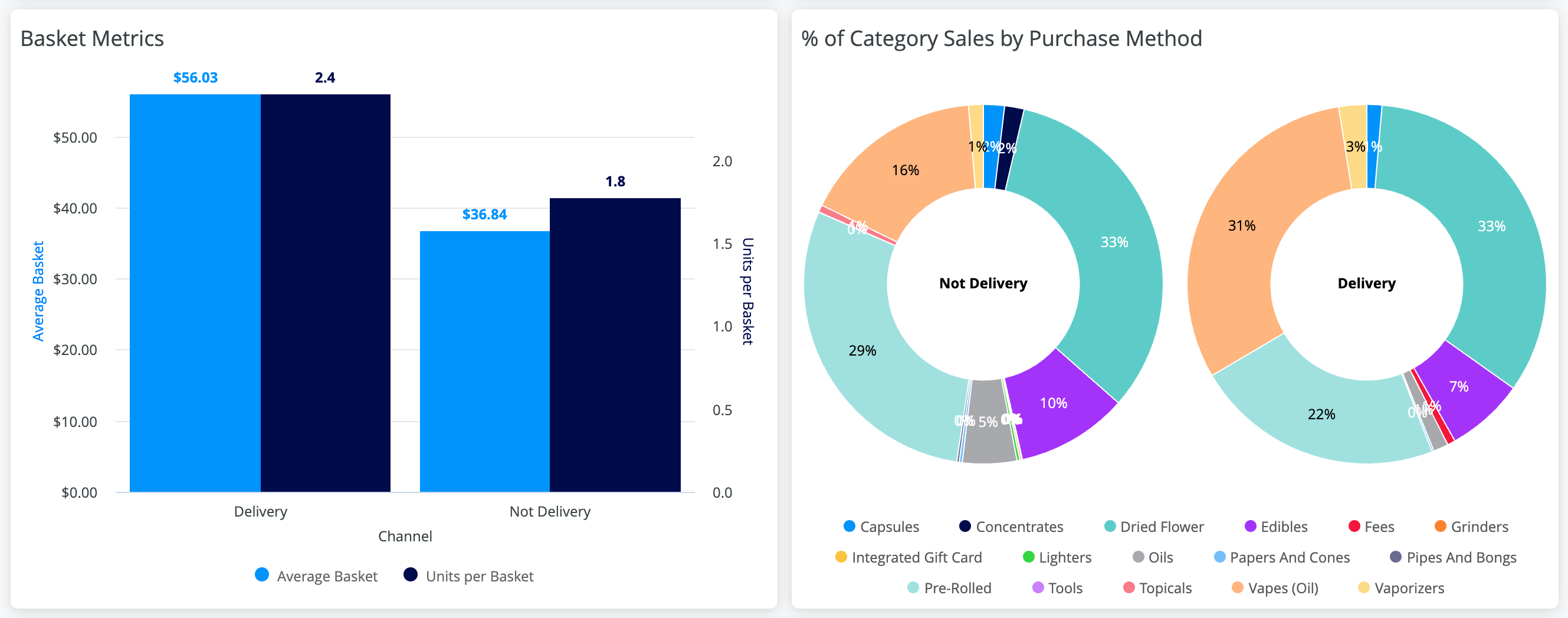
The first of these tiles compares the Average Basket (in $) and the Average Units per Basket between your purchase methods. The second tile compares the category sales between the purchase methods. Use these charts to understand the differences in customer behavior between spending methods. For example, in the store above, customers who made delivery orders tended to purchase more items and have a larger average basket than non-delivery customers.
Day of Week x Hour Performance

This tile compares when purchases happen for each method. Use this tile to look for times where delivery or online ordering may be more common. Note: because the same color scale is applied to both charts, minute differences within a purchase method category may be obscured by the larger differences between purchase methods. This is why the Delivery side looks all one color in the example above. You can hover over the time blocks to see the exact Revenue for that Hour/Day of Week or download the data for this tile to see the data holistically.
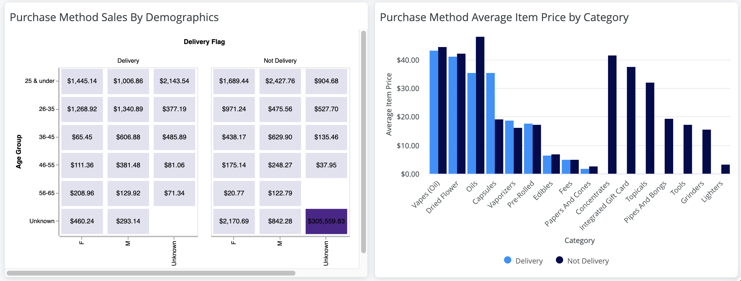
Sales by Demographics and Average Item Price by Category
The first of these tiles helps you understand if delivery or online orders are more common among particular age or gender demographics. You can use this information to help you better understand your customer and if you should be targeting specific groups to use delivery or online ordering. The second tile helps you compare the average item price for your different categories between purchase methods. You can use this chart to understand if your online/delivery shoppers buy items that are more or less expensive, or use more or less discounts, than those who shop in-store.


