.png)
.png)


About this Dashboard
What is it?
Benchmarking allows you to compare your store performance to the market overall. Is our pricing in line with the rest of the market? Do we carry a similar mix of products and/or categories as the market as a whole?
Headset provides a sample of our Insights market data in these benchmarking dashboards so you can answer these questions.
Filters on this dashboard:
Your Market: The market of the stores you want to benchmark
Market to Compare: The Market you want to benchmark against. This can be your own market or another market where Headset has data available in Insights.
Date Range: The time frame you wish to see sales for
Stores: The store location(s) you wish to benchmark
Category: Choose between seeing your categories as you have them in your point of sale or have the report to lump your custom categories into Headset’s defined categories in Insights
Using The Dashboard
Once you have made all your filter choices at the top and the dashboard has run, Headset’s Insights data will always display down the right side of the page, and your store data down the left side.
The first three tiles on this dashboard, once run, display a breakdown of the mix of categories your store(s) both stock and sell compared to the market.
In the below example, we can see that for this store location, they are selling more Flower than they are stocking and that the market overall seems to be selling more Flower than other categories. That may be an area to explore at this store location to be sure you’re keeping pace with the competition.
In addition, we can see that this store’s Non-Cannabis category is stocked significantly more than it sells.
Use this data to quickly, and visually, see where stock and sales can be adjusted to perform more consistently and evenly.

The following two tiles on this dashboard reflect pricing data in your categories vs what Headset is seeing in these categories across the market. This will help you determine if your prices are aligned with the overall market or if you have opportunities to adjust and remain competitive.
When reading the heat maps, you’ll find the categories along the bottom axis, price buckets for the items in these categories along the left axis, and the number of units sold in the time frame you chose along the right axis.
The darkest color blue would represent the highest number of units sold in that category.
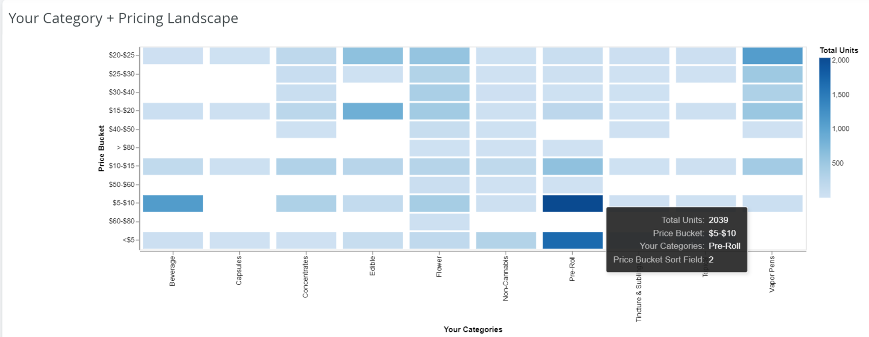
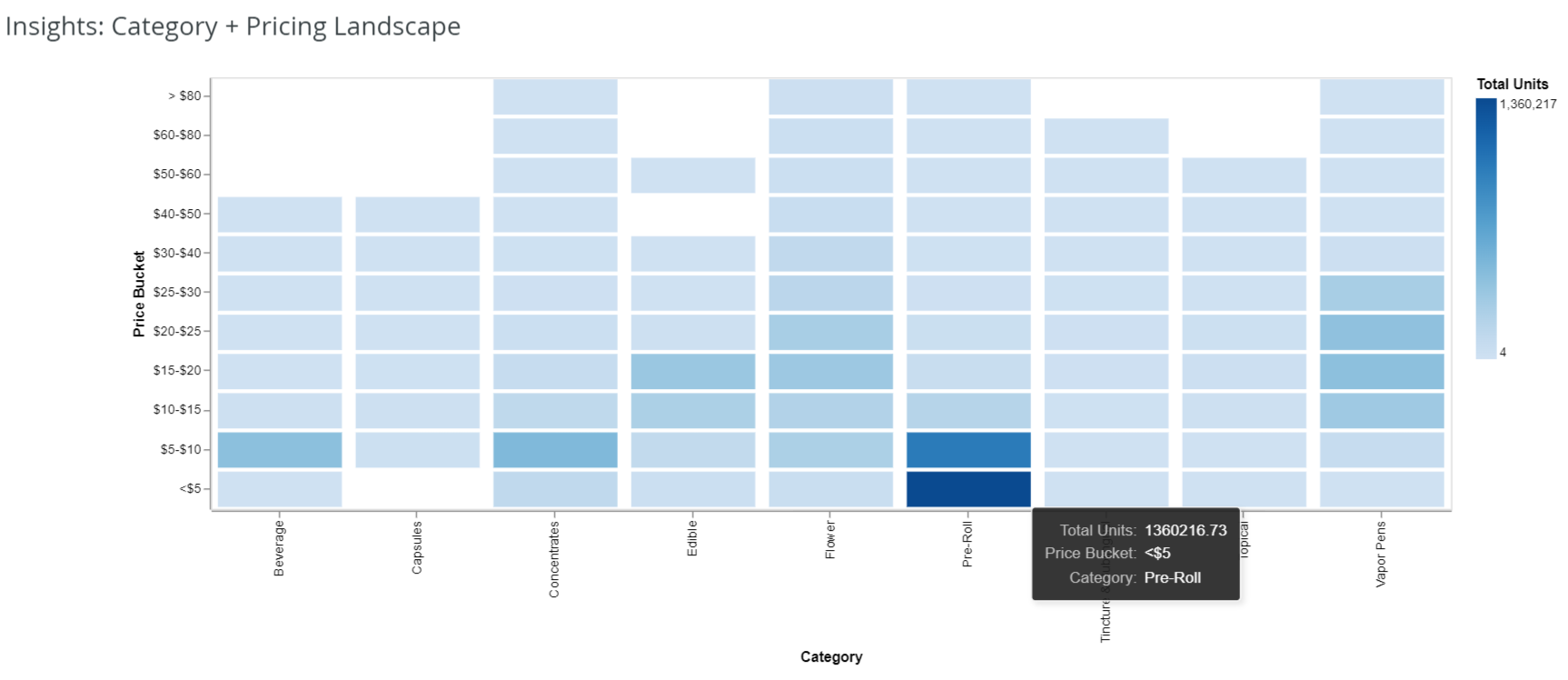
In the above examples, focusing on the Pre-Roll category, we can see that our store location’s top sellers in Pre-Rolls fall in the $5-$10 price bucket, but in the market, the top-selling Pre-Rolls fall into the <$5 bucket.
Using this data, you can start to think about how the store has its pre-rolls priced. The store is seeing high sales volume and success in the higher price range, so you may want to continue down that path.
However, knowing that in the market, customers are drawn towards the cheaper option, would it be beneficial to consider carrying more “budget-friendly” products or brands at your store location? The data on this dashboard can help you make decisions like this in a more informed way.


