.png)
.png)


Premium Demand Planning: Hourly Analysis
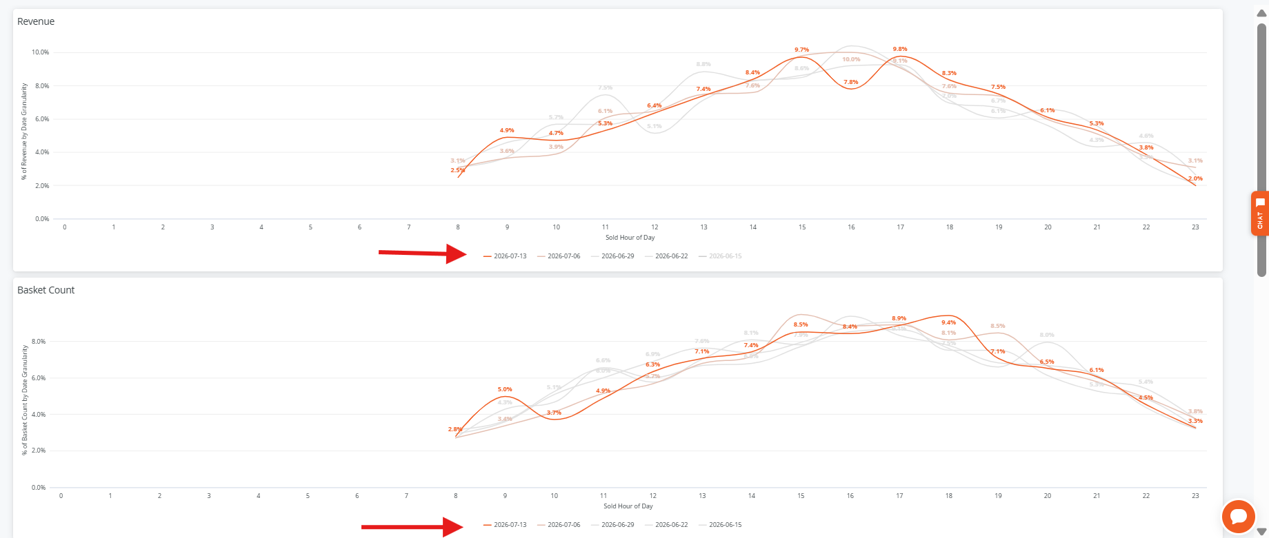
The Hourly Analysis Dashboard helps you understand how your store performs throughout the day by breaking down key metrics by hour and date range.
Revenue, Basket Count, and Average Basket Size Tiles
These visualizations are driven by your selected Date Granularity Filter (e.g., day, week, month).
Because multiple date ranges can be displayed at once, the chart may appear busy. To simplify your view:
- Use the date list at the bottom of the tile
- Click on any date to remove it from the chart
- Click again to restore
Hourly Data Table
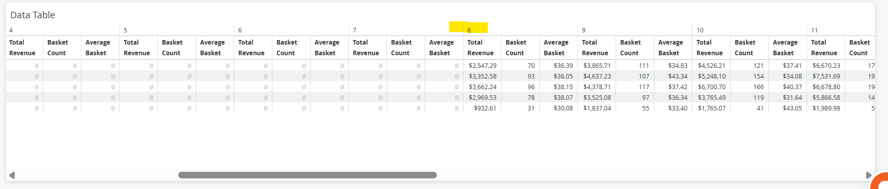
At the bottom of the page, you’ll find the Hourly Data Table, which provides a detailed breakdown of performance by hour.
- The “Sold Hour of Day” across the top represents each hour of the day:
- 0 = Midnight (12:00 AM)

You will need to scroll to the right until the hour your location opens.
For example: If your store opens at 8:00 AM, scroll to the right until you see 8 at the top of the table. This will show performance starting from your opening hour.
By using the filters and interactive elements in this dashboard, you can identify peak hours, compare performance across days or weeks, and make more informed operational decisions.

