.png)
.png)


About This Dashboard
What is it?
Time Period Analysis was built to allow you to compare various date ranges and determine if you saw a lift or decline in sales.
Filters:
Date Range: The time frame you wish to analyze sales for
Location: Store Location you wish to run the report for, or you can leave that filter blank to run the report for all stores
Compare Over: The comparison period you wish to analyze, month over month, week over week, year over year, etc.
Summarize By: How you wish to see the sales categorized (vendor, brand, category, etc.)
Break Down Date Range By: How you wish to see the sales data broken down. If you’re looking at a single month, do you want to see sales broken down into weekly totals? You tell the report that here
Metric: What type of sales data you want to analyze, revenue, unit count, or profit
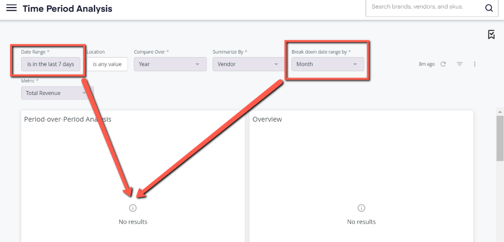
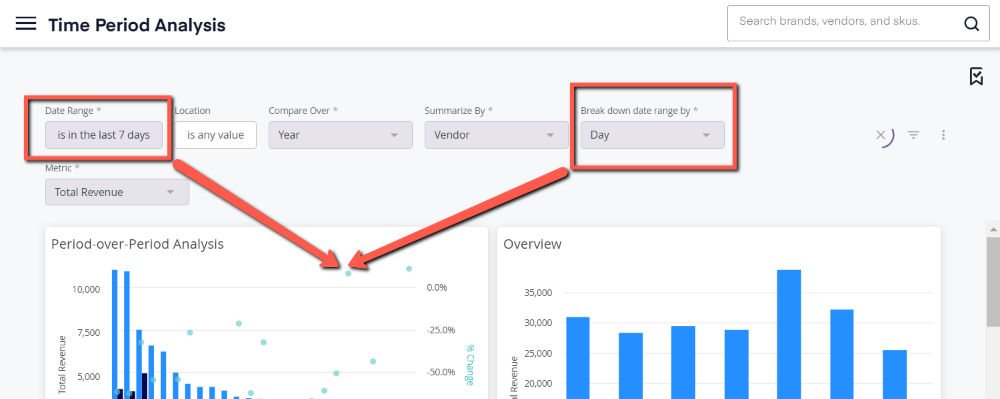
To begin, select your filters across the top of the dashboard. These filter selections must align in order for the dashboard to produce results. Specifically, your Time Frame Filter and your Break Down Date Range By filters must make sense with each other.
For example - in the below screenshot, I have my time frame set to the previous 7 days, but my Break Down Date Range By filter is set to month. Since we are only looking at a week's worth of data, this report cannot display a monthly breakdown of that, therefore the dashboard produces no results.
However, when I update that filter to a breakdown range that makes sense with my total time frame, I can get results to populate.
Once you have run your Time Period Analysis, you’ll find two tiles at the top of the dashboard.
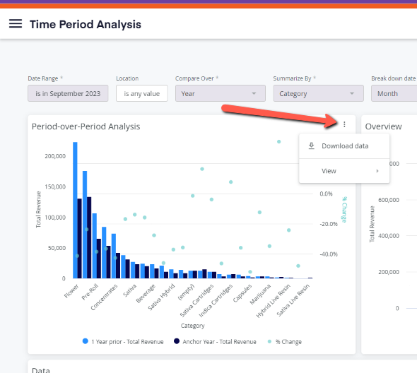
Period-over-Period Analysis is a visual display of the change in revenue based on your Compare Over filter choice at the top. In the below example, we’re looking at the month of September 2023, by category and asking for a yearly comparison.
When looking at the visualizations on this dashboard, the “Anchor Year” will always reflect what you have in your Date Range filter, and the “Prior Year” will represent the same time period in your Date Range but for the prior year. We also provide a percent change metric along the right axis of the visual.
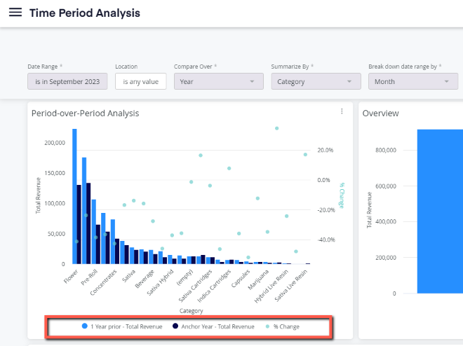
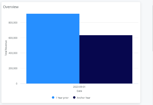
Directly to the right of the Period-over-Period Analysis is your Overview tile. The Overview displays the total revenue for the store(s) you selected and compares that to the year prior (Compare Over filter choice).
Moving down the report, you’ll find that we also provide this Period-Over-Period data in an Excel format for easier reading and downloading.
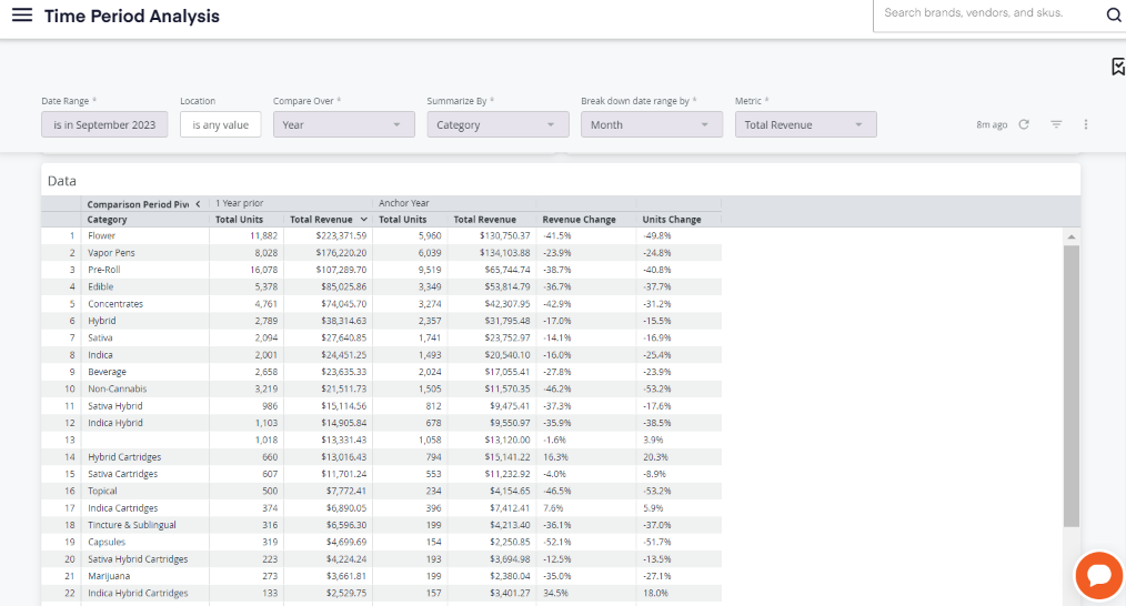
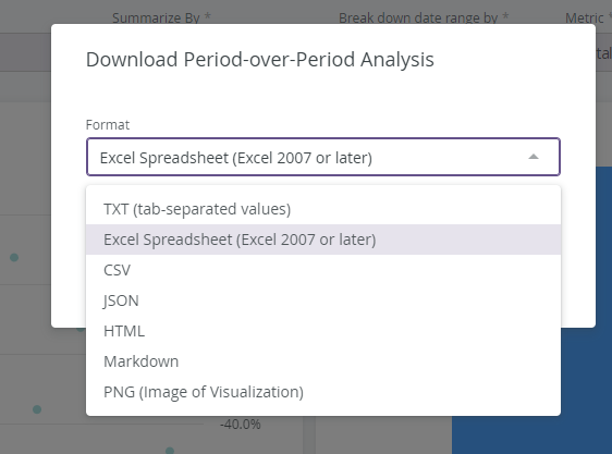
To download the Excel formatted data or the visualizations, simply hover your mouse over the top corner of the tile until three vertical dots appear. Click on those, and then on Download. You’ll have the option to download the visual (PDF) or to download the data directly into Excel.