.png)
.png)


Sales Email
The Sales Email Dashboard provides a comprehensive view of your sales performance across stores and time periods. Below is a breakdown of how to use the dashboard effectively, starting with the available filters and then walking through each section of the report.
Dashboard Filters
At the top of the report, you’ll find a set of filters that allow you to tailor the data to your needs:
- Comparison Period: Choose a time frame to compare data against a previous period (e.g., this week vs. last week, last month vs. the same month last year).
- Summarize By: Group your data by:
- Store
- City
- State
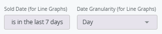
- Sold Date: This filter applies only to line graphs and controls the date range those visualizations reflect.
- Date Granularity: Choose how to break down the sold date data in line graphs:
- Day
- Week
- Month
- Quarter
- Year
- Store Filter: Select one or more stores to include in the report.
Top-Level Metrics
Just below the filters, you'll see key performance metrics:
- Revenue
- Units Sold
- Total Baskets
- Average Basket Amount
- Items Per Basket
For each metric, the dashboard shows whether performance has increased or decreased compared to the selected comparison period.

Below the top-level metrics, you’ll find detailed tables for:
- Revenue
- Units
- Baskets
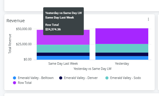
If you’ve selected multiple stores, the data will be color-coded by store for easy comparison.

Hover over each bar to see the totals for each location as well as the overall total for all stores selected in your store filter.
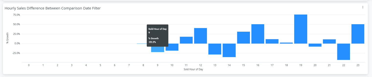
Hourly Sales
Displays sales performance broken down by hour, based on the selected comparison period.
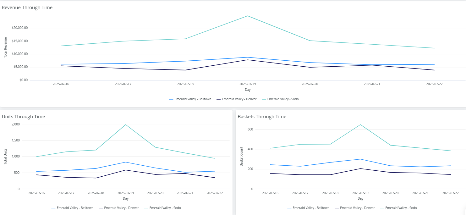
The following graphs show trends over time.
- Revenue Through Time
- Units Through Time
- Baskets Through Time
These visualizations reflect the selection made in your Sold Date and Date Granularity filters: