.png)
.png)


Year Comparison
The Year Comparison Dashboard provides an at-a-glance view of sales performance by comparing year-to-date sales from the current year against the previous year. This report makes it easy to track trends, identify growth areas, and drill into performance details at multiple levels.
This report begins by giving you a quick overview of your revenue and average basket amount YTD. We also note the percent change from the same date range of the previous year.

Sales by Week & Average Basket by Week
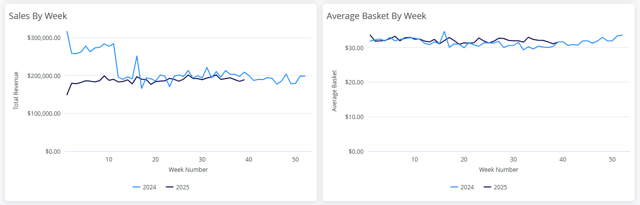
You can click on any point within these line graphs to drill down into more detailed views. Drill-down options include:
- By Dimension: Brand, Category, Product
- By Timeframe: Week, Month, Quarter
- Additional Options: Other available drill filters depending on your analysis needs
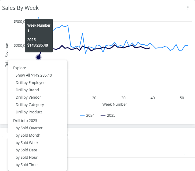
This interactive functionality makes it simple to isolate performance shifts and see how specific factors contribute to overall trends.
Category Sales (Year-to-Date vs. Last Year)
The next visualization is a Category Sales comparison.
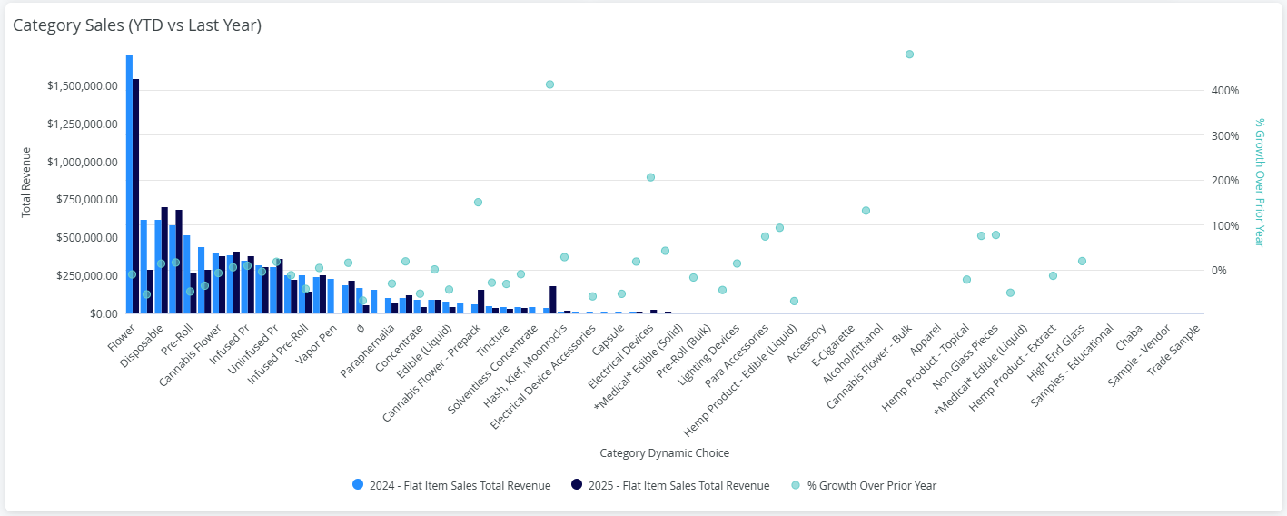
By hovering over each bar and bullet point, you can view total sales as well as the growth percentage compared to the previous year. This allows for quick insights into which categories are outperforming and which may need attention.
Vendor / Brand Sales Table
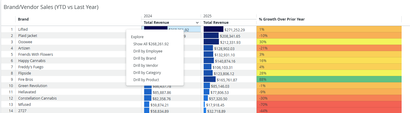
Discover which vendors or brands are driving revenue by using the Vendor or Brand Sales table, which is controlled by the Brand/Vendor toggle filter located at the top of the report.
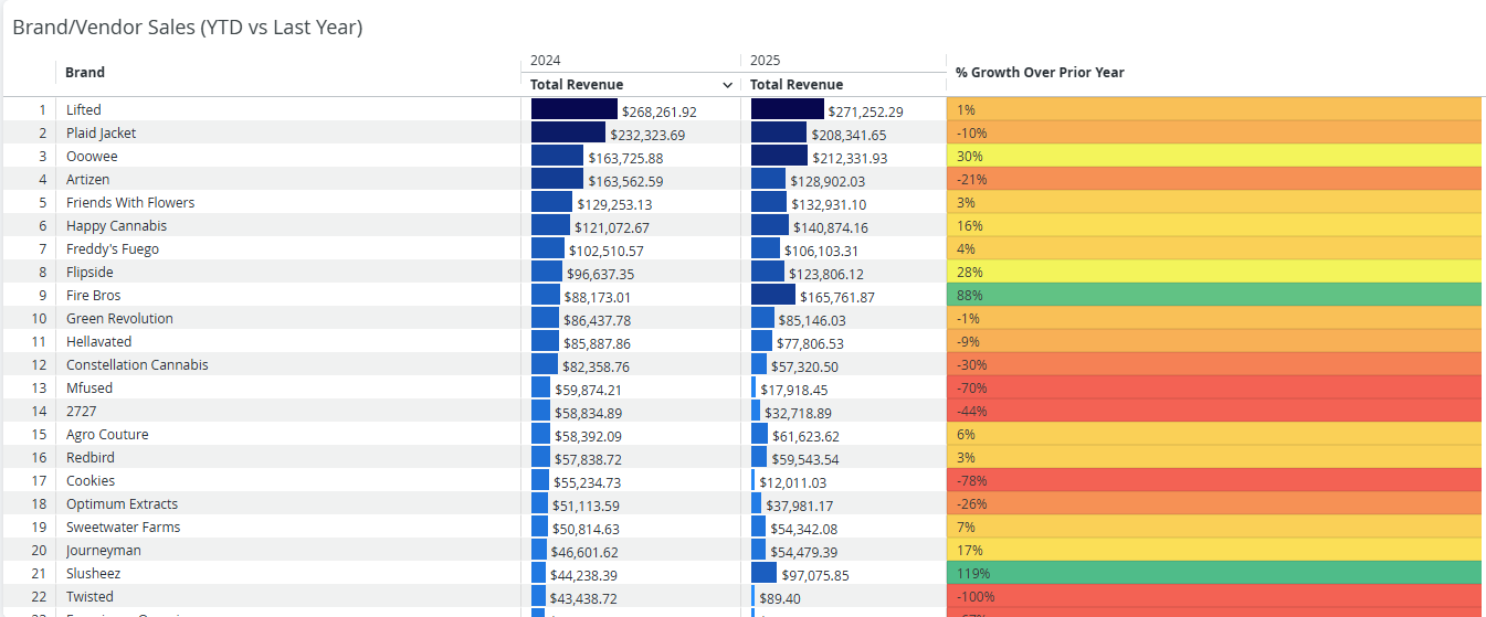
This view helps you assess vendor or brand performance, compare partners, and spot growth opportunities.
Click any revenue total to view sales by Employee, Brand, Vendor, Category, or Product.